
Creating a home that not only looks appealing but also nurtures the development and wellbeing of your family involves thoughtful decisions, especially when it comes to colour choices.
In this post, I’ll delve into the fascinating realm of colour psychology and explore how different hues can significantly impact your child’s development and behaviour.

understanding the basics of colour psychology
Colour has a profound influence on our emotions, mood and even physiological responses.
For children, whose minds are in the crucial stages of development, the impact of colour is particularly significant.
Before delving into specific colour choices, let’s understand some basics of colour psychology. It’s a theory that certain colours elicit a physical or emotional reaction and, in doing so, shape human behaviour. Because of this, colour plays a crucial role in creating a mood.
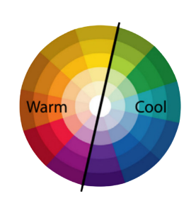
Warm Colours vs. Cool Colours
Warm colours like reds, oranges and yellows are known to evoke energy and excitement.
Cool colours such as blues, greens and purples tend to have a calming effect.
I will always choose blues and greens for bedrooms because they promote relaxation and better sleep. Neutral tones like beige and grey are popular in sleep spaces for a reason – they genuinely create serenity.
Consider earthy tones and darker colours for living areas to create an inviting and cosy atmosphere. Use pops of colour in decorative pieces for visual interest.
Kitchens, laundries and even bathrooms can be a great place to experiment with more vibrant colours. For example, yellow enhances concentration and creativity so it’s a smart choice for high-task areas or even in the playroom.
The use of colour at different ages and stages
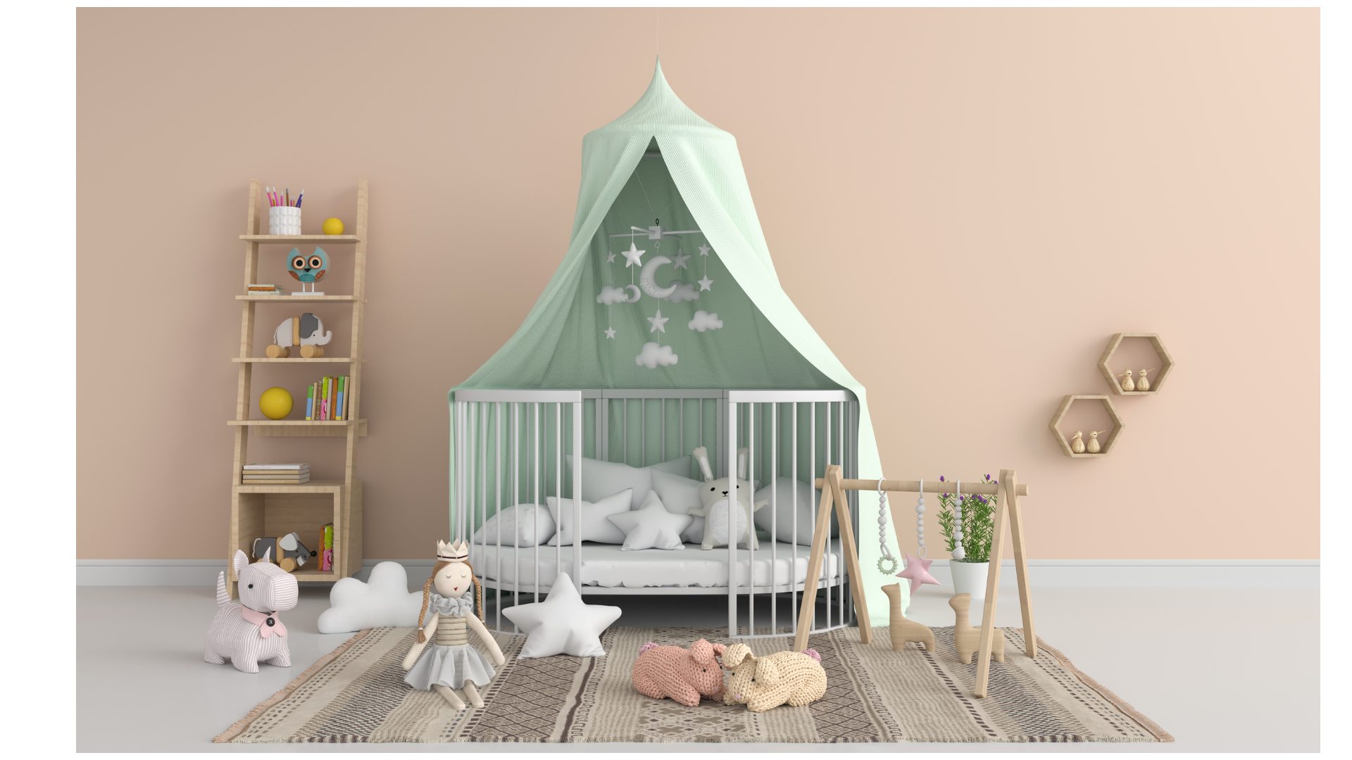
Infants (0-1 years): using soft pastels and gentle tones create a calming and nurturing environment. Introduce gentle contrasts to stimulate their visual development.
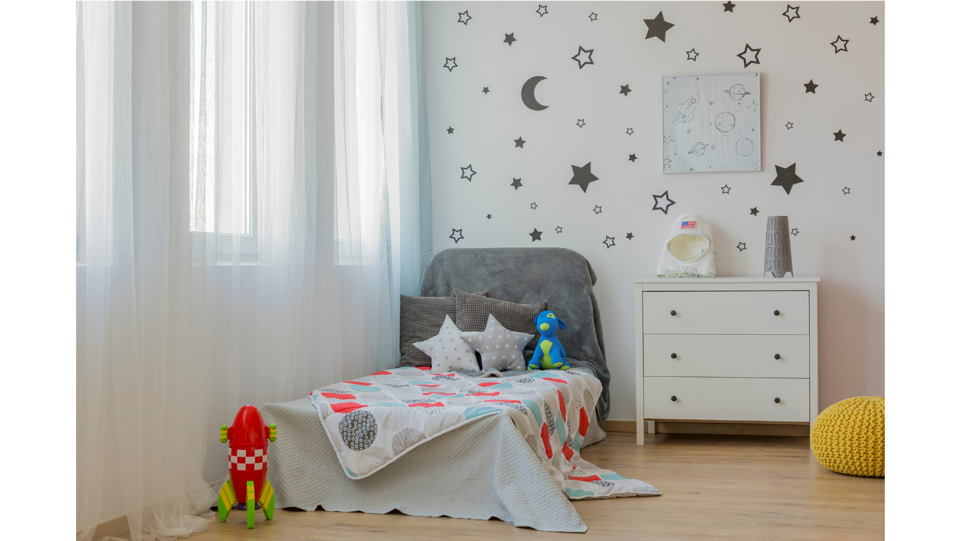
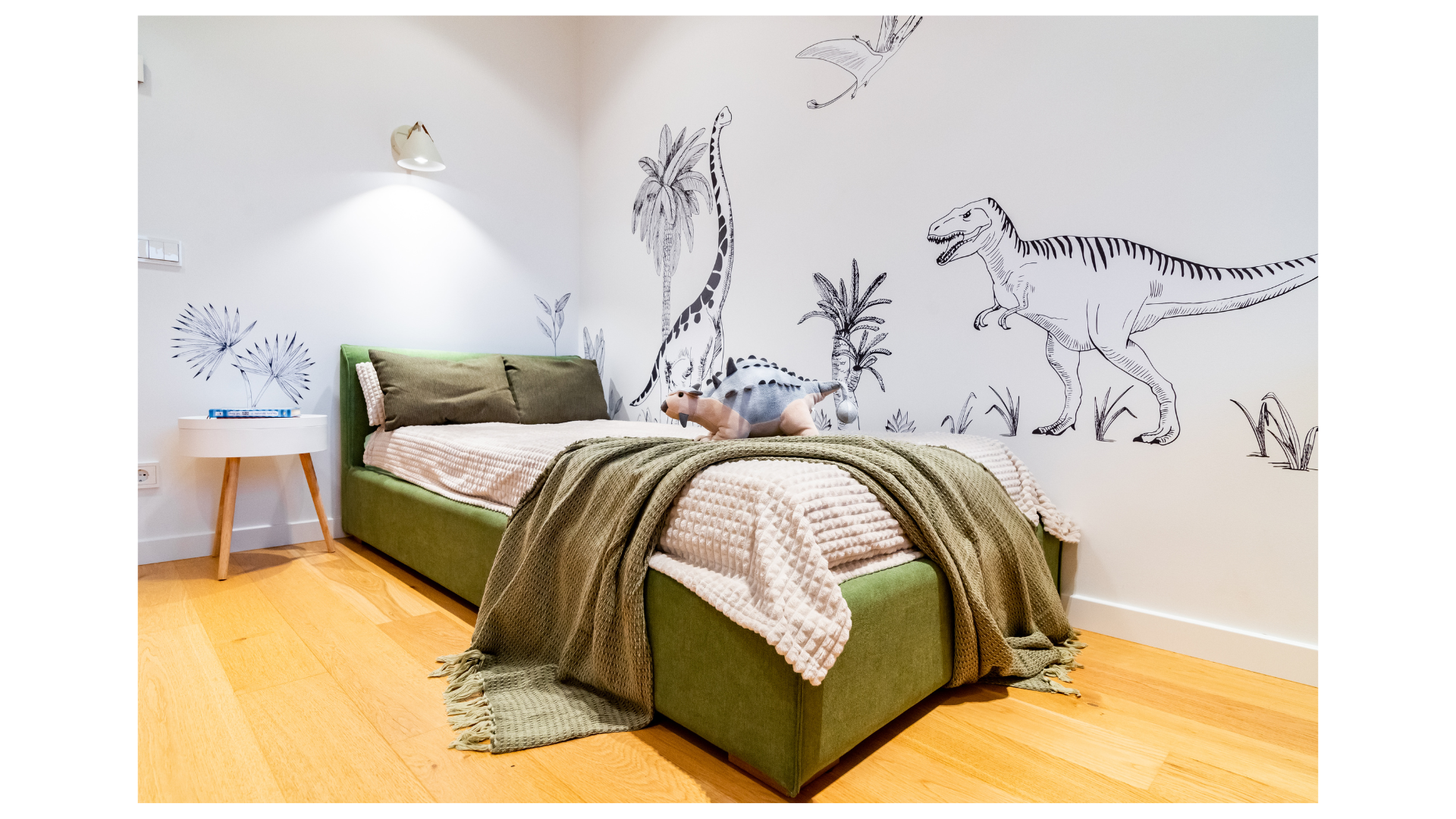
Toddlers (2-5 years): Toddlers and preschoolers often engage positively with vibrant primary colours. Consider incorporating bold colours through wall art, wall decals, bed linen, baskets and rugs. Hot tip: DON’T listen to your 4-year-old when they demand to have their bedroom painted a hot magenta pink – it is a mistake! You have been warned.
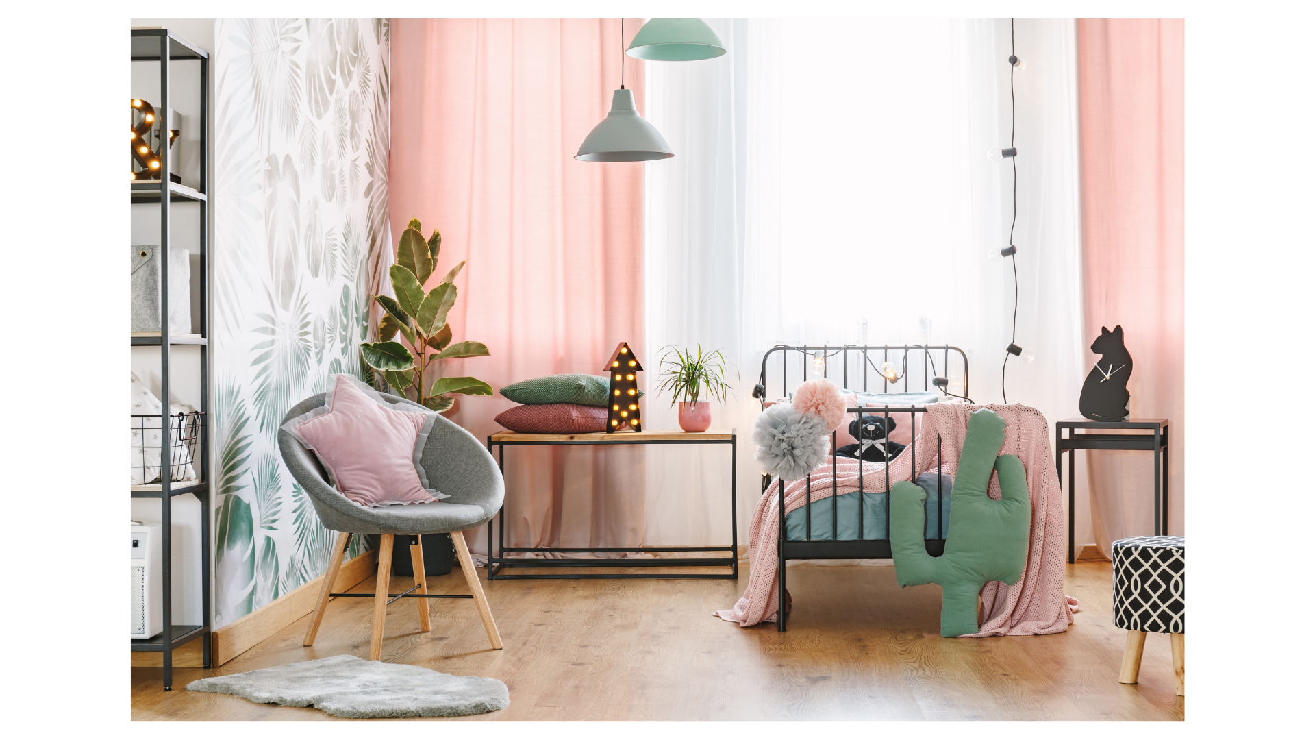
Primary-school aged children (6-12 years): Balance vibrant colours with neutrals. Now is a great age to allow them to have a say in choosing accent colours for their rooms, however I will caution you here to focus on flexibility and adaptability. Removable wallpaper or wall decals are an excellent way to introduce colour and interest that can easily changed (and are an awesome choice for renters!).
Teenagers (13+ years): Older children and teenagers may appreciate a more muted or sophisticated colour palette. Focus on their spaces being versatile as their preferences evolve, and be mindful of balancing their maturing taste with youthful qualities. Some teenagers will be drawn to darker colours as they tend to evoke a sense of security and seclusion. Others will prefer a lighter, more airy feel. It comes down to personal preference and knowing what will be in your teenager’s best interests.
PRACTICAL TIPS FOR CHOOSING COLOURS
Consider natural light: The amount of natural light in a room can affect how colours appear. Test paint samples in different areas to observe variations in light. Note: you can always opt for a half or quarter strength version of any paint colour you like.
Personalise spaces: Involve your child in the colour selection process to create a sense of ownership. Find a compromise between their preferences and practical considerations – for example, if they love orange, you could incorporate it into their play space instead of their sleep space.
Opt for versatile hues; Choose colours that can withstand changes in your child’s preferences over time. Neutral tones as a base offer flexibility for future updates. I’m a big fan of introducing colour through decorative accents, rather than painting walls, as these can be more easily and economically updated.
Think about sensory preferences: No matter the age of your child, if they tend to be someone who gets easily visually overwhelmed, opt for softer and more subtle colours throughout the home. It can be quite jarring for some people to process bold colours, especially if used in large volumes.
In conclusion, the impact of colour on a family home goes beyond aesthetics; it influences the atmosphere and dynamics within. By understanding the principles of colour psychology and considering the unique needs of each family member, you can create a space that stimulates growth, fosters creativity and facilitates calm and connection.
If you’re interested in learning more about the application of colour in design, I dedicate three whole lessons to it in makespace, my online course for parents who want to create a more beautiful and child-friendly home. In addition to teaching all the theory, I show you how to use a number of free online tools to select colours with confidence.